
How to work the rich and saturated interiors trend
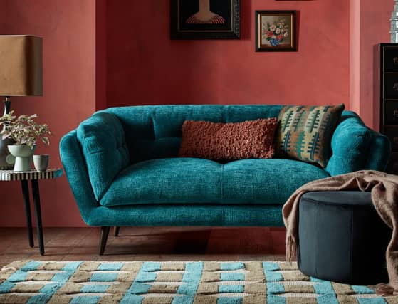

Despite being hugely popular since the early 2000s, grey gradients, muted palettes, minimalism and monochromatic colour schemes have fallen out of favour – with a newfound desire for richness and warmth a key feature.
Although this can be seen simply as an aesthetic change, Sophie Alberry-King, interior designer at City & Country, says the use of bold colouring in design – like jewel tones, greens, blues, reds and citrus hues – is a fun and individual way to express oneself.
On top of that, playing with shades and contrast can give you a more colourful living experience, highlights Alberry-King, both mentally and physically.
As a result, rich, vibrant colours are emerging as a defining trend in interior design, with a resurgence in loud feature walls and bright, sophisticated accents.
Think experimenting in new ways, injecting more personality into a space and reframing bold designs as a forward-thinking vision… rather than being aggressive and brash, suggests the designer.

“We’re using highly pigmented, eye-catching shades; from bright hues to more muted tones like deeper wine, olive and mustard variations.
“Eclectic interiors have also surged in popularity on TikTok – the trend for ‘bold chic’ interiors allows us to play with design conventions, and be a bit more adventurous with our projects.”
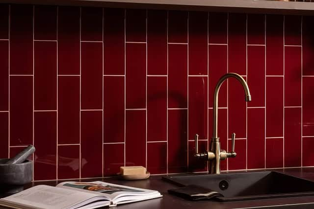
If bold colour is something you’re wanting to experiment with, start small at first, she advises. By bringing colour into the bathroom or entrance of your home with colourful tiles or a brightly painted cabinet, she says it’s possible to add a pop of colour without seeming overbearing.

Alberry-King continues: “Whilst bold colours can invigorate a space, they require a balance to avoid over-stimulation. To achieve this, it’s important to use vibrant tones strategically to create a harmonious living space.”
For example, she says focus on using contrasting, neutral tones of wood, creamy white and complementing tones on accent walls or trimmings.
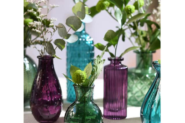
“Introduce your bold bright colours through accessories such as deep green vases, wine-red hardback books, and royal blue cushions or curtains.”
She says City & Country’s in-house design team incorporate rich shades into show homes through accent pieces, with plush armchairs and decorative cushions complimenting the space.
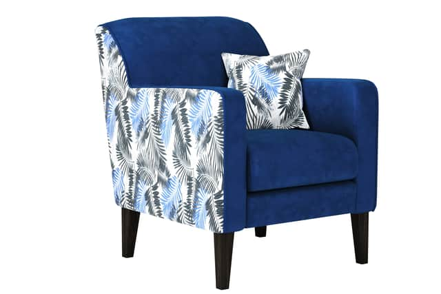
Perfectly placed, pairing bold colours with neutrals or softer tones creates harmony and ensures longevity in design. “The trend also encourages layering a mix of textures and patterns alongside bolder colours, adding depth and interest.”
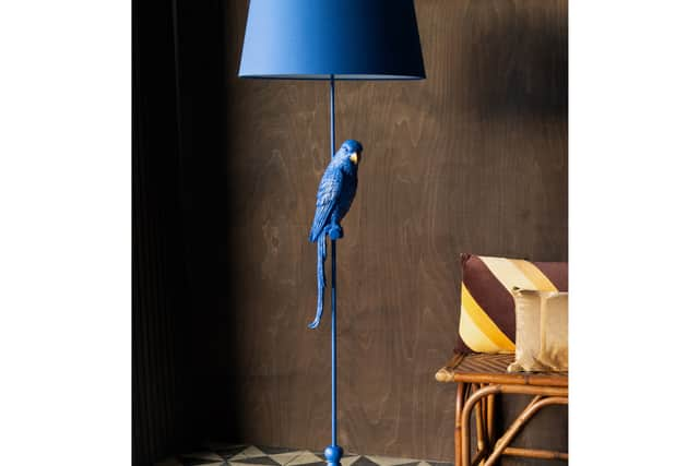
“With a consistent style and theme across your home, blending vibrant features with neutral elements will create a (surprisingly) calming balance.
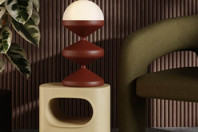
Indeed, colour psychology has always played a large part in interior design trends, notes Alberry-King. “But a reinvention of this psychology has arrived with the big and bright colours of 2025.
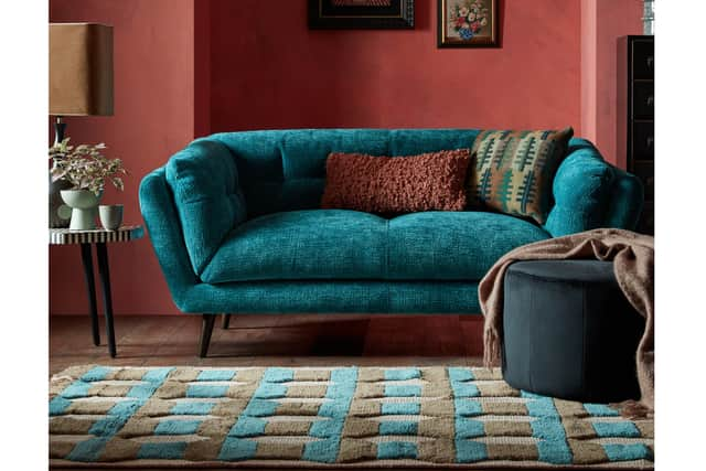
Furthermore, she says the saturated colours trend is more than just a fleeting phase. “It’s a reflection of a society in flux, with people wishing to create their own sanctuaries and fully express themselves.
“The future is to live more vibrantly in our surroundings,” she adds.