
How to use paint to make your space look more luxe
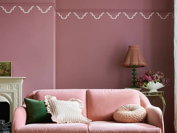

From warm, earthy neutrals to muted pinks, to colour drenching, the right paint finishes will lend an air of opulence, says Sam Wylie-Harris.
When you think of before and afters, one of the simplest ways to change the entire aesthetic of a colour scheme is with a lick of paint.
Especially when you’re looking to add warmth to a room, create a feature wall to let a favourite piece of furniture stand out or a prize work of art.
“What I love about paint is it’s probably one of the most simplest ways you can transform a space,” says Cathryn Sanders, head of creative at Earthborn, who’s responsible for colour creation, trend direction and supporting the creative side of their photoshoots.
“And if we’re talking about luxury, that’s when you don’t have to think about it being expensive because paint can do that quite easily.
“It can transform a room, it’s about creating a feeling the space has been thoughtfully considered.
“If you think about a cohesive room colour, paint will bring it together, and you can also use contrasting shades for different features,” highlights Sanders.
Here are some of her favourite ways to create a more sophisticated, layered feel…
Start with warm, earthy neutrals
There are quite a few ways you can do this, suggests Sanders. “Obviously you can think about tonal, so if you’re looking at the warm, earthy neutrals, then you can layer those across your space.”
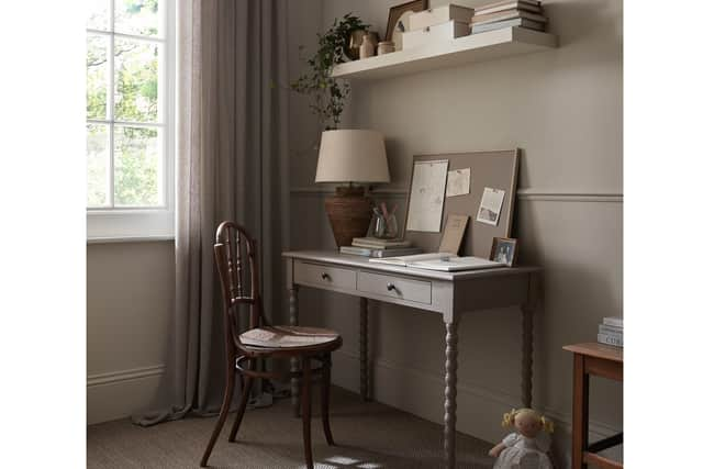
“So think about the walls, the ceiling, and the woodwork, but in a tonal-neutral shade. When people think about luxury, they might think stark white shades; but definitely warm, earthy neutrals can elevate a space by doing that.
“And not just picking one shade, having those tonal shades.”
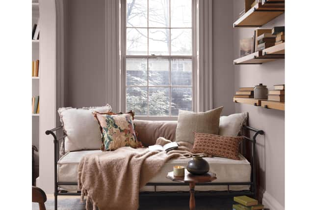
For a cohesive look, try related shades across walls, ceilings and woodwork in hues such as stone, clay, plaster and taupe, suggests Sanders. “They create softness without feeling flat.”
Don’t be afraid of darker colours
“When someone’s got a smaller space, or a north-facing room, they’re concerned about using a darker shade,” highlights Sanders.
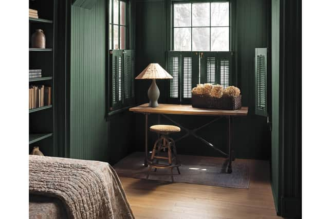
“But I would definitely say that darker doesn’t make the room smaller.”
Moreover, she says darker colours can be incredibly luxurious because they create a sense of intimacy. “Deeper shades like greens and berry colours can make it feel like a rich and intimate space.
“One example I saw quite recently, was someone’s home office. They’d used a dark forest green on their walls – and scaffold boards for shelving – so it had that natural-wood finish with the dark green… it felt like a nice, intimate, cocooning space,” says Sanders.
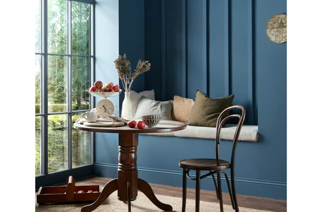
Try introducing forest, hunter and deep greens; navy, inky and deeper blues, along with rich berry shades. “Then highlighting that with natural woods or grasses, that sort of thing,” she adds.
Think beyond soft pinks
“I think we’re definitely seeing a lot more pink now, and it’s not those soft sweet pinks anymore,” underlines Sanders.
“They feel a lot more grown-up, and again, they can add that touch of elegance… moving away from the sugary, traditional feminine spaces.”
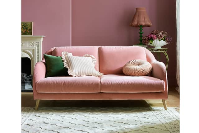
“If you pick a pink that’s got perhaps more of a brown, red, or lilac undertone, it does feel more sophisticated.”
Versatile too, she says, can soften harder surfaces while adding warmth. “Pink doesn’t have to be used on all four walls – perhaps try it on cabinetry or panelling to make a feature.”
She says they can be particularly effective in rooms that don’t receive much natural light, and rely on layered, artificial lighting. “They [pinks] can definitely give more of a rich feel.”
Think a muted pink across walls and woodwork for a tonal look, or use a deeper berry shade as an accent.
Try colour drenching
Trending big time, painting everything the same shade – walls, ceiling, skirting boards and radiators – is one of the simplest ways to make a room drip in splendour.
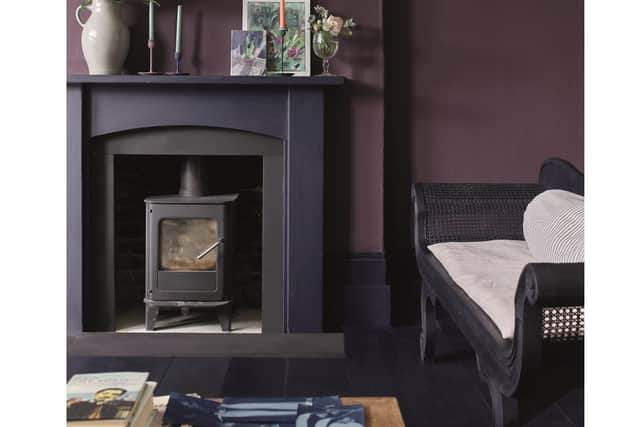
“I think colour drenching has been around before it even became colour drenching,” opines Sanders.
“Move away from having your white skirtings, your white ceiling, white radiators… be brave and paint the walls, ceiling, and woodwork in cloaks of colour.
“Or going back to tonal, what I was talking about with the warm, earthy neutrals, you could do it tonally – you don’t need to just pick one [colour], it’s thinking about being cohesive in what you’re doing.”
And with this, she adds: “Be intentional with your shades – it’s not just about being bold for the sake of being bold. It’s about creating an atmosphere, and I think that’s what colour drenching is.”