
Galway City Council defends new ‘civic g’ as rebranding continues

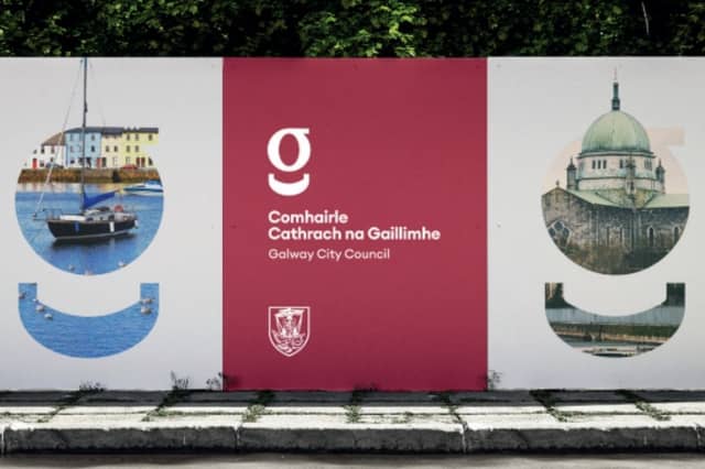

Galway City Council has described its new logo as the ‘civic g’, saying its new branding is intended to put people before the institution and make its services more recognisable.
At a media briefing, Richie McCarthy, Head of Communications and Corporate Marketing at Galway City Council, outlined the thinking behind the new identity, which is being rolled out across the local authority's services.
“What we had before was a logo. Now we have a brand,” he said.
Mr McCarthy explained that the council wanted “consistency of branding” across its services, making it easier for the public to recognise and understand the work carried out by the local authority.
The branding project was guided by an ambition to be “human before institutional,” celebrating the contribution of people within the city.
He said the previous Galway 'G' did not always clearly identify Galway City Council, while the crest incorporated into the old design was so small that it could be difficult to see.
The new 'g,' he argued, was clearer, more distinctive and more recognisable.
“The new 'g' is concise,” he said.
“It is more clear than the one we had before. It is more distinctive and recognisable. The crest on the old one is so small you can't see it.”
The aim, he explained, was to communicate with “clarity, consistency and authenticity”, while building public trust in the council and its services.
In a presentation, he said Galway City Council leads with “honesty, accountability, transparency and responsibility”.
The new branding has already been introduced across the council's social media channels, while vehicles, bins and uniforms will be updated as existing items come up for replacement.
Mr McCarthy also acknowledged the significance of the original Galway 'G', designed by Jimmy Conneely for the city's quincentennial celebrations in 1984 and adopted by the council in 1987.
The city's Coat of Arms would remain an important part of the new branding, he said.
He also referred to the public interest generated by the ‘Keep the Galway 'G'’ campaign, led by Woodquay publican Fergus McGinn, whose father-in-law designed the original symbol.
Mr McCarthy said the campaign had come as a surprise but welcomed the enthusiasm it had generated around the history of the Galway G and as “an awareness piece for Galway City Council”.
In terms of public consultation, he said that surveys were sent out “to business groups including the WestEnd, all business representatives, SPC members, staff, elected members and Oireachtas members.”
He confirmed that the project “needed to be rolled out” and that there was “no need to wait for the communication strategy.”
Further delay would have “provided more confusion” and “would have held up other projects.”
In terms of the move to Crown Square premises, he said that “we were running the project anyway” and that it “is a coincidence”.
He also said it “is not a rebrand project” as the name of Galway City Council remains the same.
Funded by the Local Democracy Reporting Scheme